|
-
Cadillac to change its logo in the next year
Cadillac will be dropping the wreath that is around the crest in its updated logo. I wonder if there will be any more substantial changes to the emblem. It would be cool if there were some fan art shots of what people think the emblem might end up looking like after the redesign.
I am partial to the 1948 logo. I think they should bring back the V shape.
-
I agree with bringing back the V shape, especially since "V" is what they use for naming their performance models "ATS-V" & "CTS-V"
Whatever they do will be quite different from what we've ever seen since it will have to live on for another decade or more.
-
We know that Cadillac will be dropping the wreath, but is this the only change to the logo? Will the new logo simply be the crest without the wreath? I hope not. The crest could be given an update as well to modernize it a bit. It would be cool to see the V again, and I could also see them putting the crown back on top of the crest.
Anyone else have any redesign ideas?
-
-
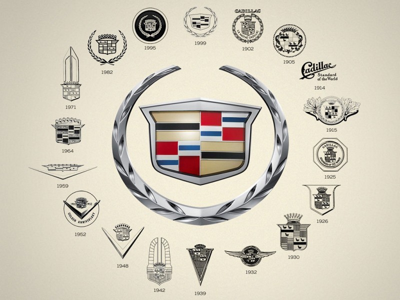
Never even knew Cadillac had so many badges.
-
 Originally Posted by cfrp

Never even knew Cadillac had so many badges.
Me too.....
-
Originally Posted by cfrp
Never even knew Cadillac had so many badges.
yup, cadillac is really old, I guess with so many more brands that are far more established than Cadillac, it pushes cadillac under the rug.
-
With the unveiling of the Elmiraj concept car also comes the unveiling of Cadillac's newly designed logo. Here it is:
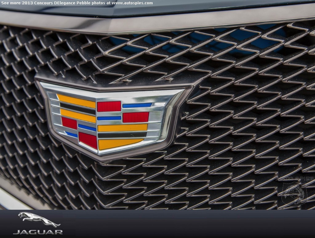
Notice that the wreath is gone, and the crest is wider. The top of the crest has the iconic v-shape that Cadillac is known for. Definitely an improvement over the last one they were using.
-
Originally Posted by mr.smith
With the unveiling of the Elmiraj concept car also comes the unveiling of Cadillac's newly designed logo. Here it is:
Notice that the wreath is gone, and the crest is wider. The top of the crest has the iconic v-shape that Cadillac is known for. Definitely an improvement over the last one they were using.
I love the new badge, i was expecting a much more different and unique change, but keeping it simple is always a good thing.
-
Actually, that is REALLY nice, in my opinion!
-
Originally Posted by mr.smith
With the unveiling of the Elmiraj concept car also comes the unveiling of Cadillac's newly designed logo. Here it is:
Notice that the wreath is gone, and the crest is wider. The top of the crest has the iconic v-shape that Cadillac is known for. Definitely an improvement over the last one they were using.
This is basically what I expected. The slight stretching wider was a good decision. It makes the crest look more modern, and it makes the Cadillac V shape subtly noticable at the top of the crest. A big improvement over the previous logo.
-
Tags for this Thread
 Posting Permissions
- You may not post new threads
- You may not post replies
- You may not post attachments
- You may not edit your posts
-
Forum Rules
|
|


 Reply With Quote

 Your Privacy Choices